Been a long time since I did any simulation in R! Today I was presented with a nice opportunity too.
I received a message from my brother today saying “sqrt(rand()) gives you the same probabilities as max(rand(), rand()) assuming rand() returns a number between 0 and 1.” I was immediately intrigued as this didn’t make intuitive sense to me. However, no need for intuition! This is a data-driven blog, so lets look at this in a data-driven way.
My goal here is to create a couple of simulations that simulate sqrt(rand()) and max(rand(), rand()) and see what their distributions look like.
I’ll start by loading a couple of useful packages and set a seed for reproducibility.
library(dplyr)
library(ggplot2)
library(tidyr)
set.seed(42)
I like to follow David Robinson’s examples here and treat simulations as mutating a dataframe. To do this, I start by setting up three columns of randomly generated numbers in a dataframe, then use dplyr to create new columns with my transformed sqrt and max values.
Note that R does not actually have a rand() function. Instead, for generating a uniform distribution of points between 0 and 1 we can use the runif() function with its default parameters.
Also, we use pmax rather than max so we can compare multiple vectors.
N <- 100000


df <- tibble(
  num_1 = runif(N),
  num_2 = runif(N),
  num_3 = runif(N)
) %>%
  mutate(
    sqrt_rand = sqrt(num_1),
    max_rand = pmax(num_2, num_3)
  )


df_long <- df %>%
  select(sqrt_rand, max_rand) %>%
  pivot_longer(cols = everything(), names_to = "variable", values_to = "value")

head(df_long)
## # A tibble: 6 × 2
## variable value
## <chr> <dbl>
## 1 sqrt_rand 0.956
## 2 max_rand 0.701
## 3 sqrt_rand 0.968
## 4 max_rand 0.341
## 5 sqrt_rand 0.535
## 6 max_rand 0.497Excellent, looks like we’ve got the data we need. All that’s needed now is to plot it a few different ways. I’m going to create a histogram, a ecdf, and a pdf
ggplot(df_long, aes(x = value, fill = variable)) +
  geom_histogram(alpha = 0.5, position = 'identity', bins = 50) +
labs(title = "Histograms of sqrt(runif()) and max(runif(), runif())", x = "Value", y = "Count") 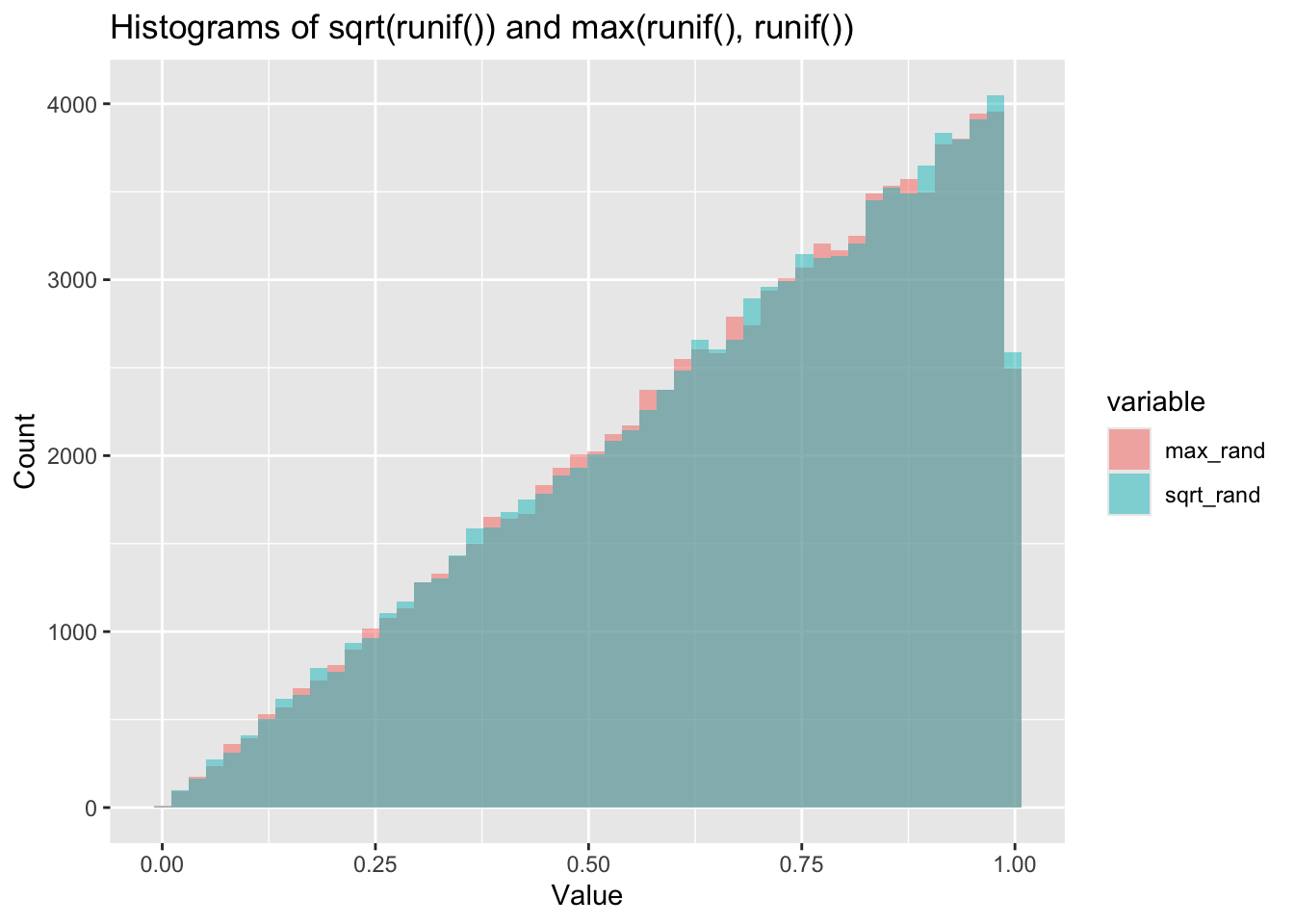
ggplot(df_long, aes(x = value, color = variable)) +
  stat_ecdf() +
  labs(title = "ECDFs of sqrt(runif()) and max(runif(), runif())", x = "Value", y = "ECDF")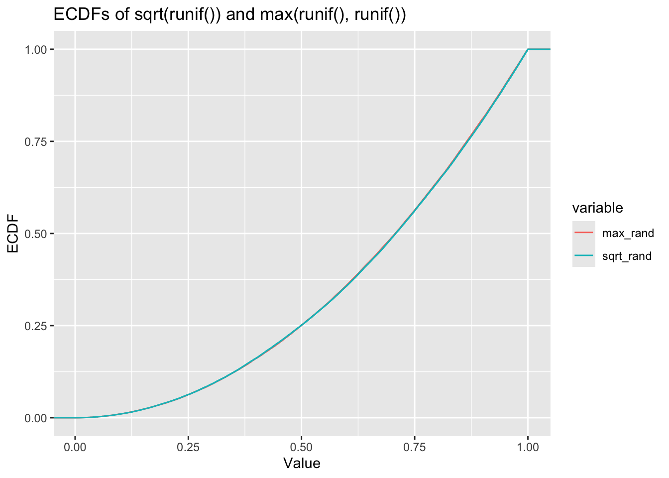
ggplot(df_long, aes(x = value, color = variable)) +
geom_density() +
labs(title = "PDFs of sqrt(runif()) and max(runif(), runif())", x = "Value", y = "Density")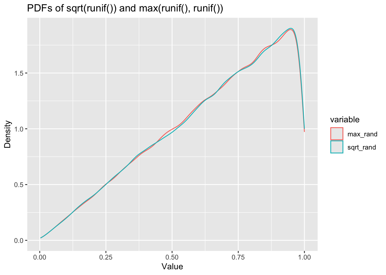 There you have it - it seems pretty clear from these plots that these are following almost identical distributions. The ECDF in particular is almost impossible to see there are two lines there.
We can run a Kolmogorov-Smirnov test to check whether these are the same distribution, however, the KS test is extremely sensitive to sample size, and with 100,000 data points we are practically guaranteed to get a high p-value. We’ll run it anyway just for fun.
ks_result <- ks.test(df$sqrt_rand, df$max_rand)
ks_result
##
## Asymptotic two-sample Kolmogorov-Smirnov test
##
## data: df$sqrt_rand and df$max_rand
## D = 0.00414, p-value = 0.3582
## alternative hypothesis: two-sidedYeah, high p-value, providing evidence for the null hypothesis (there is no significant difference between the two distributions).
I’d really like to dig into this and work out the maths behind why these are the same distribution and also explore for different parameter values for runif(). Unfortunately, this is all I have time for tonight. Maybe there will be follow up post…